23 Apr 2010

This week I have mostly been working in copper

“The world is an old woman, and mistakes any gilt farthing for a gold coin; whereby being often cheated, she will thenceforth trust nothing but the common copper” Thomas Carlyle, Victorian essayist.

Hammered copper, heavily antiqued, spiral link bracelet.
Please click on any of the photographs for a larger view.

The last couple of weeks have been hectic – an assortment of commissions to complete, work commitments, domestic dramas, our visiting son (I’d like to think he comes home from university to catch up with his Mum, but in reality he was only availing himself of my fast broadband connection, as the dent in my bandwidth allowance will testify) and even some time away over Easter.

So if anyone happened to be so devoid of entertainment they were monitoring my publicly visible work rate, they’d perhaps consider me tardy of late – I haven’t seemingly had much to show for the long hours and exhaustion levels.

I spent a lot of time before we went away for Easter in preparing things to take with me to work on; part-made components to finish, components that I could make into ideas I had etc. – all in case of bad weather and the need to find things to do. I had enough materials with me to make a hundred pieces of jewellery. All I eventually managed was this necklace (with matching earrings) and another pair of earrings. Antiqued copper and green glass.

I quite liked the smooth look of the back of the antiqued bracelet above, where polishing off the oxidisation, left a pattern of colours on the smooth copper, from bright peach to a deep gunmetal type blue/grey. So I made another version without the hammered texture and will give this the same colour finish. I sometimes just like to enjoy them in their raw state before I give them their final colour.

A spiral wrapped Botswana agate bracelet in it’s raw copper just-tumbled state, which has since been deeply oxidised and extensively tumbled to a deep gunmetal warm grey.

But behind the scenes, like a little hammer-wielding gnome, I have been quietly (not that my hammering can ever be claimed to be quiet) producing several new pieces. But the making of the jewellery is the fun bit – that’s where I find my joy, peace from the world and my personal satisfaction – I get so embroiled with the details of shapes and the engineering of making things work properly that the world just passes me by and I often only come to my senses when the growling in my belly reminds me that I really should have had lunch several hours ago.

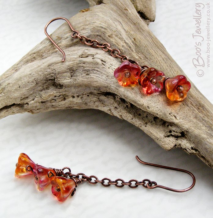
Hammered and elongated soldered chain link earrings, with rosy copper molten buds.

But once complete, after enjoying it for a short while on my own, I must present the result of my efforts to the world. I really can’t expect pieces to sell if they’re still sitting on my work bench unseen. And this is the part, like most artisan sellers and self-representing artists, that I find most tedious, time-consuming and plain disagreeable.

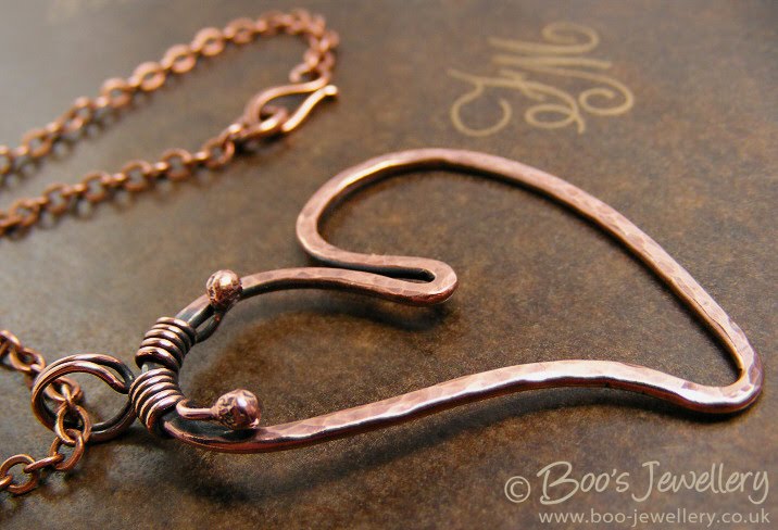
A pendant in progress, which has since been antiqued. I love to see raw shiny just-tumbled copper, so often take WIP photos at this stage. Just because the colour is so pretty.

As someone who has listed photography as a passion for an alarmingly large number of years, I do not find photographing my work to be in the least bit enjoyable. And despite having now done quite a lot of it and to have gradually honed my workflow to be about as efficient as I think I can get, it still seemingly takes an inordinate amount of time – far longer than it feels like it should or I’m happy to give it. And don’t even get me started on the process of measuring everything, working out a price and writing appropriate descriptions. I get through it by issuing myself with incentives – if I finish listing two items, I can work on the bracelet I’d started etc.

Large Serpentine beads spiral wrapped with copper into this bracelet with hand crafted hook and an adjustable chain closure and Aventurine dangle. The copper has been antiqued.

So, in the purely selfish interest of trying to make it look like I have actually done something of late, I present some of my latest pieces and the first photographs I’ve taken of them. I’ve also included some work in progress photos (WIP) as I often take photographs for my own reference and they don’t otherwise ever see the light of day.

Only another 25 pieces and several hours wrangling photo props and cameras and then manipulating images left to go!

18 Jan 2010

I’ve pimped my lighting diffuser

Further to my tutorial article on my own hand made – for free – lighting diffuser for product photography, I have added some features which I’d had in mind for a while and thought I’d pass the ideas on.

If you want more information on photographing small objects in this manner, I also have a more general tutorial on the photography process itself, in respect of small items.

I had reason in December, when taking some product shots for a client that were a little large for my usual diffuser, to utilise a larger bucket I’d saved for such purpose, to make another larger one. I incorporated the new feature ideas I had in mind and liked them so much, I added them to my regular small diffuser too. I now alternate between them, depending on the size of the piece I need to photograph, or the set props I want to squeeze in. The new features have been really indispensable, so I wanted to outline them for those that found my original tutorial useful.

By drilling a hole in the side, I can poke twigs, dowels etc.
through to hang earrings. See below.

The basic premise – and I do recommend reading the article linked to above first – is to use an upturned translucent bucket (mine contained fat balls for wild birds) as both a lighting diffuser and reflector, for small item photography. By lining the side opposite the light source with scrunched aluminium foil which reflects a great deal of additional light back onto the subject, I can get away with using a single light source – although granted mine is a daylight fluorescent ring, so the light is quite spread already and a good colour.

I use my upturned fat ball bucket diffuser for all my jewellery photographs.

I already have a magnifier light clamped to my work bench to use when working on small and fiddly things, so I developed the original diffuser to make use of this and minimise the set up time when I need to take photos – for many years I’d been over-complicating things using multiple lights and my DSLR and it was just no fun taking photos at all – once I cut out most of my gear and started using a compact camera, it became much more workable.

Sometimes it’s easier to get an overall flat view by lying the subject flat
and shooting it from overhead, using the hole I cut in the top for this purpose.

My diffuser lives pretty much permanently on the end of my bench on top of a pile of background papers and I just pull to the top of the pile the one I want to work with. Consequently, I don’t have much space to work in and so must do so efficiently.

I made a very rough diagram to show the various features.
Please click to see a larger view, it’s easier to read the annotations.

Further to the original tutorial, I have added 4 features to my bucket diffuser:

  1. Some background paper inside the bucket to give me a safe shooting zone for lower angles;
  2. A small slot cut in the top/bottom to take a clip to hold additional background papers;
  3. A hole drilled in the side to allow a dowel, twig, rod or wire to be passed through to hang earrings off;
  4. I’ve lined the lid with scrunched kitchen foil to use as an additional diffuser and protect from reflections.

1. The original bucket was lined on the light side with tracing paper to diffuse the light and the opposite side with scrunched aluminium foil to scatter and reflect the light back from my single light source. The lighting just needs to be diffuse enough to soften any harsh shadows from your light and prevent any unwanted reflections from items outside the bucket. I still like to retain some soft shadow to give the subjects form. If the light is too diffuse and too flat, items can start to look a little unrealistic and lacking in shape.

My original bucket worked pretty well, but I had to be mindful of my angles taking the photos and keep above the subject, so that I didn’t catch any of the inside of the bucket in the background. But occasionally, you want to shoot something as though it were at eye level and this perspective requires a suitable background behind. So I tacked a fairly narrow piece of vellum textured white card opposite the opening I take photos through to give me a small region of safe background to align myself with when needed. As most of my subjects are small, it doesn’t need to be very wide. Using white as a starting point didn’t impact on the light levels.

Sometimes I like to shoot from below the subject, or at eye level and this requires a safe area behind the subject.

Using tracing paper on the light side of the ‘bucket’ diffuses the light source nicely and softens the shadows from the uni-directional light, but I still like to see some shadow to give the subject form and depth, so I don’t diffuse it too heavily.

2. To supplement this, I also cut a slot in the top (what was the bottom) of the bucket to allow me to use a small stationery clip to hold additional backgrounds in this area. I made this slot by drilling a row of holes parallel to the edge and then cutting the spare plastic out from between them and sanding off the rough swarf.

I tend to use long thin background papers with this clip, to allow me an infinity sweep type background behind long earrings etc. If I attach it at the top and let it naturally curve behind the subject and onto the base, I have no ‘joins’ and this increases my space visually.

Using a long narrow piece of background paper, clipped only at the top, I get a natural curve behind my subjects.

3. As you can see in the photograph above, the earrings are hanging on a piece of dowel. My third new adaptation, was to drill a hole in the side of the bucket so that I can poke a rod, dowel, wire or twig through the hole – clamped securely outside of the bucket – and hang earrings and other pieces from it. Previously I had a stand I used within the bucket, but this is much simpler and works much better for me – I found the earlier incarnation to be clumsy in use.

I used a ‘helping hands’ style clamp outside the bucket to hold my dowel in place. I’ve since made a purpose built clip on a weighted base that takes up less space and frees up my clamp for other tasks.

4. After trying to trace a bright yellow reflection in some polished silver one day, I realised that the open top of the diffuser bucket is quite a vulnerable spot when taking photos of flat reflective surfaces. The hole in it (cut to allow overhead photographs to be taken) offers no protection from reflections – my yellow spots were from something small on a shelf above me – so I lined the lid from the original bucket with the same scrunched aluminium foil and just sit this over the top of the bucket to kill any overhead reflections and to further reflect a little light back in – I found that I have gained a third of a stop exposure just from using it and it makes the overall light that bit more diffuse too. So I just leave it in place unless I need to access the top.

In this case, I used a dark blue clip to hold my background paper, so that you could see it in the photos, I usually use a white one. You can see the foil reflector above, stuck to the inside of the spare lid.

I can easily lift it off when I need to use the hole or clip papers in place, or just use the overhead hole for wrangling my subjects. I actually lined the outside of the lid as it had a lip which stood proud and this allows it to sit in place over the smaller base.

The hole to take a twig and the slot to clip background papers allows me to hang long earrings naturally with minimal working space.
24 Sep 2009

Set dressing your product photographs

The photography of small hand crafted items to make them available for sale is a perpetual source of frustration and anguish and often detracts from time available to spend on actually making things – the fun part!

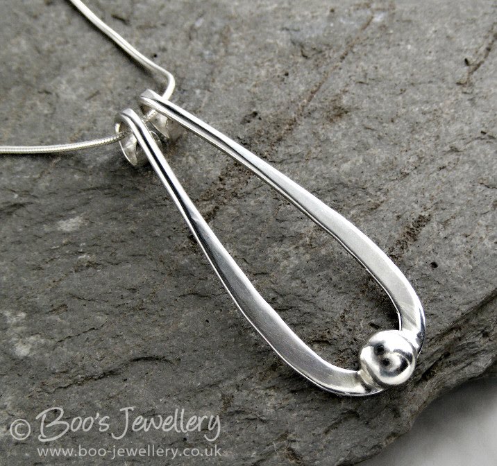
One of my favourite backgrounds, a piece of green slate bought from the Honister slate mine in the English Lake District. I de-saturated the colour of it a little in this image as I just liked the texture against the smooth polished silver. I bought several pieces for my garden as it’s a gorgeous jade colour when wet – I must remember to wet it one day when I use it.

There are many issues of concern associated with product photography – from the decision on what camera to buy to technical photography issues, lighting issues, finding the best place to work etc. etc. One subject that often comes up is that of backgrounds and ‘set dressing’ – how many additional props are distracting and do things look better on plain white or black backgrounds, letting the item speak for itself?

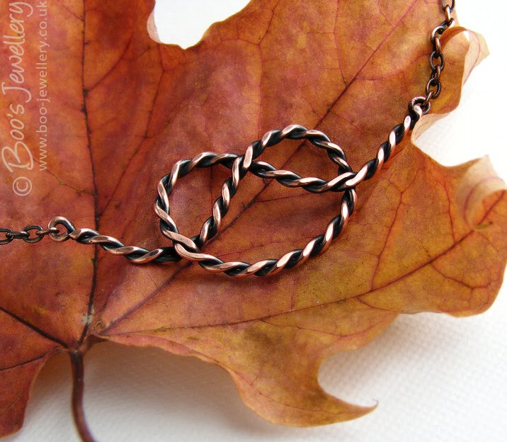
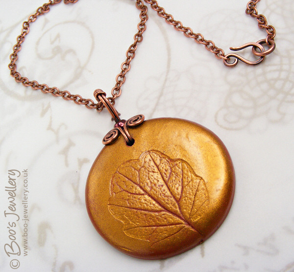
As we approach autumn and as I just love the colours, textures and shapes of fallen leaves, I wanted to use these as props in my photographs and this maple just screamed out to be teamed with some copper.

Some people recommend that all of your photographs should use the same style, setting and colour way to give a cohesive feel to your shop and establish a style that will be associated with your work, but I feel that even if my customers liked the results, I’d personally get pretty bored working on similar looking photographs week in, week out. In order to retain my own interest in the project, I enjoy thinking of ways to show a piece off, to find papers and textures to use as backgrounds and small found objects to use as props.

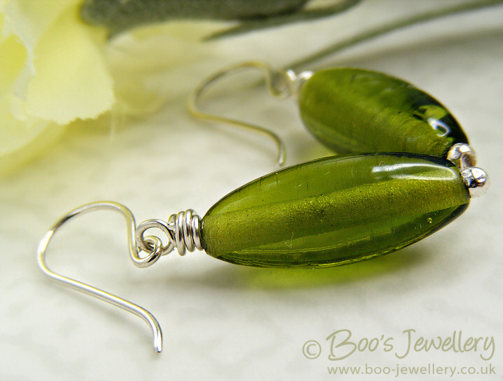
I thought these hand made glass earrings looked like spring leaves, so a light parchment base and a hint of spring blooms with a silk flower in the background enhanced that bright feeling.

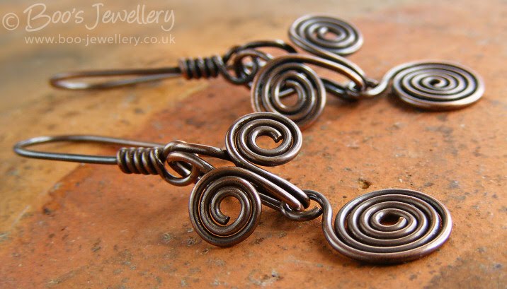
Another well used favourite – this is the bottom of a handmade earthenware pot I rescued from my grandmother’s pantry – it is a lovely rich colour that can lift the pieces and has just enough texture and detail to make it interesting.

I’m personally of the opinion that a little window dressing adds to the overall attractiveness of the final photograph. You want to make an attractive image where the props and backgrounds compliment your work, hopefully without overpowering it or detracting from it. Some of my favourite objects are simply household items, often looked at from a different perspective – as above, the bottom of this pot is rather more interesting than the view you’re supposed to appreciate.

This little piece of driftwood is becoming quite the star of my photos. It’s just the right size, a nice gentle colour and has lots of ridges and notches to prop work against. I found this on a lake shore after a storm – it has been smoothed by being thrown about in the water for some time. It’s simply a lovely piece of natural sculpture.

I especially like textures for backgrounds – nice hand made papers, natural surfaces and colours that enhance the piece. I have amassed quite a collection of items to use. Very few of which I have paid money for. If I see a nice paper lining a box of chocolates, or wrapped around cut flowers I’ll retrieve it. I have an A3 size zipped portfolio that I store all my papers in and I periodically rifle through them to use pieces I’ve not done so for a while, it’s easy to keep working with the same backgrounds and I have to remember to refresh the look once in a while.

This background paper is the lining parchment from a box of very expensive chocolate truffles.

Is your background too dominant – then tone it down:

The initial tip I started this blog to pass on was a way of making your backgrounds go further – several looks from a few papers – and can also make the results more subtle where your favourite paper is a little too bold. Some time ago I bought a pack of 5 sheets of parchment paper – A4 sheets of translucent paper each with a slightly different watermark within the paper. One is marbled, another striped, my favourite has random splodges. If you place a piece of this parchment – tracing paper would work too, but would be plain – over your background paper, it immediately tones it down significantly – reducing the contrast of a pattern that might overpower your piece.

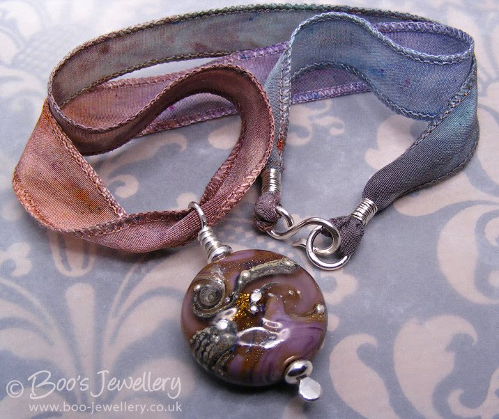
The kraft paper I used here came wrapped around some supermarket cut flowers. It is black and tan coloured and far too contrasty on its own for a background, but under some parchment, it was toned down and took on the right colours to blend with the lampwork bead and silk ribbon.

Of the 5 original sheets, I regularly use 3 of the patterns and they’re always out in my photography area, slipping one over your background paper, immediately give you a whole new look. You can retain the pattern and colour cast of the paper you liked in the first instance, but it is now much more subtle in appearance.

This background is a sheet of gold printed tissue paper, where the print is rather too clear for a background, but I like the colour and design of it. Placing it under some parchment toned the print down yet left me with the print I like.
21 Aug 2009

Using reflections creatively to remove hot spots

This blog should be read in conjunction with my tutorial on small item photography and my article on my ‘free to make’ lighting diffuser.

Yesterday I had to photograph a flat silver hammered pendant and it reminded me that this was a blog I had in mind to post.

Photographing flat metal parts on jewellery can be very problematic, especially highly polished silver, as it is mirror like and tricky to show any detail in – or to avoid showing detail that you don’t want. But I have a couple of little tricks that should help you out. The examples used below are not especially competent, but slightly exaggerated – and done rather quickly – to illustrate the points – I’d recommend a little more time spent will get more subtle results. Please click on the photographs to see better views, they look rather dark on the page here.

Unwanted reflections:

Unwanted reflections can look pretty unpleasant – you don’t really want to see the photographers distorted face in a curved surface on a piece of jewellery you might want to buy or a shiny prop used in the set – a huge great nose-heavy hamster like face gurning out of you from the metal. By simply angling the piece away from front-on will change what the item reflects – and hopefully the ceiling or inside of the light tent will be more attractive than the photographer’s hands etc. and in many cases, this simple step alone will be enough to remove the unwanted details – or at least make the reflections less distracting. Angle the piece so that any flat surfaces reflect areas with little detail in or at least avoids items that are recognisable – we’ve all seen the examples of reflective eBay items with nekkid photographers. {{{ shudder }}}

With small digicams that are hand-held out in front of the photographer for them to use the screen display on the back, you often see a pair of hands and a camera in reflections – even in tiny areas of metal, where simply re-positioning the piece might not be enough. One of my methods for combatting this, where a simple change of position doesn’t suffice, is to make a screen for my hands – I have a square of kitchen paper (just because it’s flexible and easily replaceable) where I cut a circular hole in the centre, just large enough to slip over the camera lens – on mine I’ve taped a couple of tabs on the back so that I can keep hold of it too, to prevent it flopping in front of my lens. I hold this in front of the camera as I work and the only thing to reflect then is some white and a grey/black circle for the lens. A little less obvious and distracting than the pink of hands.

You want the true colour and detail of your piece to show, not be bleached to white from your lights.

But we can do better than this can’t we?

Yes, we certainly can. And it doesn’t take much. With flat silverware, especially in a setting where you’re adding lighting for your photography, such as a light tent – or I use a translucent bucket as my diffuser/reflector – you can get very bright hot spots of light reflected off the metal surface, especially if it’s highly polished. This can lead to what photographers call blown highlights. Highlight areas on the item where it is so bright white that no detail is recorded at all.

A blown highlight is one where the pixels in that area are completely white – no image data is recorded at all. Once this happens with an image, the blown area is lost forever, there is no detail at all to work with in your image. Underexposing the image can overcome modest highlight issues, but for a really hot reflection, this simply won’t be enough.

You can see how the light source on the right has created a very hot reflection, with no detail at all, on the shiny surface of this polished silver.

These blown areas not only look unattractive, you can’t see any detail and it’s maybe important that you do. You want your piece to look shiny and for the polish you’ve worked hard to give it to be evident, but not at the expense of too much detail being lost. So the best way to combat this is to create more appropriate & creative reflections. Actually make the piece reflect something other than the light.

The creative use of a manually added reflection has put the detail back into this otherwise hot surface. I had to make a modest adjustment to the exposure of about two thirds of a stop to counter the slightly darker image.

My own favourite technique is deliciously simple and I use it a great deal. I have a collection of small pieces of black and grey card – ranging in width from around 13mm (½”) to 40mm (1½”) and about 200mm (8″) long and I crease them a couple of inches from one end and bend it at right angles. These cards can be positioned around the perimeter of my diffuser, at the lighted side, the bent tab at one end trapped under the edge of my diffuser, to reflect back onto the piece where otherwise too much light is reflected. The tab sticking out allows me to swivel it around the outside of my ‘diffuser’ to find the best position.


This causes the grey or black area of the card to be reflected off the metal where previously light was being reflected back. This kills the hot reflection and allows the detail to show. Where you position it and what size and colour of card you use will be determined by the size of your piece, your lighting source and a little trial and error.

I’ve used black card in these examples to exaggerate the effect, grey would have given a more subtle effect in this piece. Just hold the card initially and move it around see where you get the best effect. Sometimes a long thin piece will give a nice striped band over the surface, making it look shiny, sometimes you need the entire surface (if you have an engraved surface or similar) to reflect something back, so a larger piece would be more appropriate.

You can also use something like a ‘helping hands’ tool or simply a paper clip, blutak or stationery clip to temporarily position a small reflector where you get the best effect. Look through the camera and move it round in your hand until you like the effect on your subject. Sometimes I put the camera on a tripod or bean bag and set the 10 second timer and move the reflector until I like the effect, then hold still for it to take the photograph. I sometimes do the same with a little LED torch for the opposite effect, if I want to try and get a highlight in a particular place.

As you can see, you don’t need a very big piece of card to reflect back and darken the surface. I used black in this instance to exaggerate the effect.

Reflected light may be more subtle:

My own lighting set up, as linked previously, uses a ‘bucket’ diffuser with a single light source at one side and scrunched aluminium foil pasted inside the opposite side reflecting that light back onto the subject. Where I find I get very hot highlights, I have found that rotating the subject within my diffuser so that it faces the reflector side rather than the light source often gives better results. I have a little less light on the subject this way, but that’s often just what’s needed. The aluminium foil has been scrunched up before sticking in place, so the reflected light is scattered over the subject, removing the more direct light that often causes the hot highlights.

This image was taken facing the reflector rather than the light source and is more subtle as a result. I used a small reflector to put some shape into the bail and some darkness at the bottom of the oval where it was otherwise brightest.

One of my finished images, taken with the set up shown above. I wanted to make it look shiny and show some form to the bail, so used a thin black reflector in this image.