12 Nov 2009

The perpetual gift-giving dilemma gives rise to a new piece

If you’re a craftsperson like me (I use that term loosely to mean you make things) you’re surely familiar with the dilemma we continually face around Christmas and birthday times when it comes to gift giving. Do you give your nearest and dearest yet something else you’ve made, or head to the shops?

Please click on the photos to see a larger view.
They look rather dark and woolly here on the page.

The way I see it, if I’m going to spend a given amount of cash on someone, if I spend that on raw materials and increase its value by adding a chunk of my time too – they ultimately get that much more of a gift, value-wise, than if you’d spend the same cash on something priced at retail. This is especially worthy of consideration when times are hard and you simply don’t have enough dosh to buy something you feel would be suitably worthy. Not to mention that most people value a little extra care and thought than just popping into a department store and grabbing the nearest shiny. For me, personal time given is ‘value added’ in every sense of the word. I’d much rather have an hour of someones time than know they just flashed the plastic.

But do others appreciate that thinking? Do they get sick to death of some piece of hand made goodness, no matter how carefully crafted or how many hours invested? Do they just think you’re a cheapskate? I do have one particular relative who always calls my creations ‘home made’ deliberately to demean them. But thankfully she’s the exception.


It’s a perpetual dilemma to which there is no easy answer. I hope those that I invest the most time on will take it in the spirit in which it’s intended – an effort to make my hard earned cash go that bit further, as well as giving them something that is perhaps even more precious than a few quid – some of my time and a resulting piece that I often aim to remain unique for them and something I’ve given particular thought and care to. I actually really enjoy sourcing materials, sketching designs and ideas in order to create that particular piece I hope they’ll treasure.

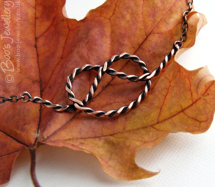
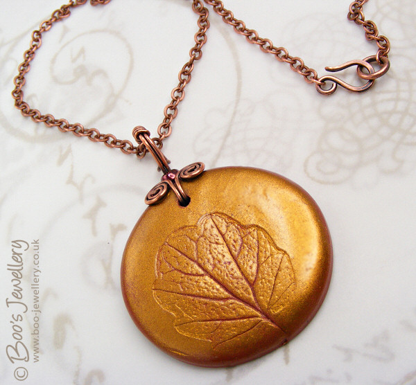
Which is what took me to a reel of copper wire this week, to test out a Christmas gift idea I had, before committing myself to some Sterling silver. I wanted to try a chain maille technique I’d done before with rubber ‘O’ rings – a chain making technique which uses closed and usually fairly thin rings – where most maille techniques use open jump rings – at least initially to create the weave. This weave starts with closed rings that you shape and link together.

I know this as a loop-in-loop weave, but it may well have other names. It is reputed to be one of the oldest chain patterns found in antiquities, examples have been found up to 3000 years old. The design often features in Roman jewellery and as they knew a thing or two about personal adornment those Romans, that’s good enough for me.

I soldered together a handful of rings of a guessed size and made a section of chain. The first attempt looked very nice, but there wasn’t enough space for it to move and the chain was too rigid, so I made some sightly larger rings. Only a couple of millimetres larger in diameter (but over 6mm more wire in each loop), but it made quite a difference to the weave. They were now a little too loose and open.


But I made a few more to see how it flowed in a decent length and decided that I liked the loopy open look of it, so stuck with the size. It was intended to be a snagging and measuring exercise before I made a reach for the silver (I think of them as prototypes – I learn by trying), but I actually really liked the result in copper, so made a pile more rings and made me a bracelet.

It took me a while to work out a clasp design and methodology that worked with the shapes of the chain links, but I’m pretty happy with how it worked out – after a bit of trial and error and some that weren’t quite right. I often see beautiful chain maille pieces, with poorly executed clasps or commercially made ones just plonked on. To me, the clasp is an incredibly important part of a design. It has to work efficiently, so be well engineered, but also sit comfortably aesthetically alongside the rest of the piece – to look like an intentional part of the design, not an afterthought.

So this one needed a little extra thought (I left it overnight for my brain to work on) as the links are directional, so one end of the chain is a different shape from the other, so making the clasp flow nicely, but with connections 90 degrees from each other and to reflect the shapes of the main links, took some working on. I also have bruised fingers for my trouble too. It’s hazardous stuff this jewellery making.

I took some photos of it in its raw copper post-polishing state while I decide what final finish to give it. I’m erring towards antiqued – as I just like that colour best – but it depends on how the silver soldering will look once oxidised.

What do you think?

22 Oct 2009

A personal caller in disguise

I went out of the front door briefly earlier and as I returned, spotted that I had had a caller. He was waiting patiently on the door itself, the colours of his wings blending perfectly with the rather shabby timber of my old front door.

Please click the image to see a larger version.

I wasn’t sure how long he would wait around, so just grabbed some photos with my little camera to hand – the moth was positioned against a strut in the door making positioning the camera and the lighting a little tricky, so the photos aren’t very good, but I was just amazed at how clever he was to find the door that was timber of just the right shade to co-ordinate with his own colouring.

My reading would suggest that it is an Angle Shades moth – Phlogophora meticulosa – and they are often to be seen in autumn, resting out the day on walls and fences where their scallop edged wings and russet colours blend perfectly with autumn leaves.

I think moths are often treated as the poor relations of butterflies and their habit of flitting against windows and around lights on summer evenings makes people skittish and wary of them. But they’re stunningly beautiful and I was delighted to spend a few minutes with my caller today.

30 Sep 2009

Tutorial: wrap your own cord ends

I have a firm philosophy of trying to create as much of my own work as possible – by that I mean creating as many of the individual components that complete a piece as is practical. I like to make my own clasps, jump rings and pins. Some parts are easy to forge yourself, some clearly can’t be replicated with ease and you need to concede defeat and just buy in the parts.


I often hang necklaces on PVC, leather, silk or cotton thong and whilst there are many commercial cord ends available, I prefer to wrap them myself where possible, which gives me the opportunity to match the rest of the piece more closely, which is particularly desirable with copper pieces – where the scant amount of copper findings commercially available rarely match the finish you’ve given the copper yourself.

When I first started making my own, I searched for a tutorial for wrapping the coiled spring type cord ends – figuring that there must be a technique to make it easy and reliable to replicate a uniform finish.


I never found one that suited my needs, so I grabbed my tools and wire and set about devising a reliable technique. Having settled on a method that worked well for me, I recorded the stages so that I could now make it available in a tutorial of my own.

I work directly from the end of the wire on the reel and only cut it off once I get almost done. I would estimate that the cord ends shown below use about 125mm (5″) wire each – obviously this could vary enormously depending on the diameter of the cord to be covered and how many loops you choose to make your ‘spring’ section. The example in the photos is 0.8mm copper wire on 3mm diameter PVC.


I use a pair of stepped looping pliers (as shown in the photos) as this gives me the opportunity to create neat coils of rings consistently the same diameter, as the pliers have several sections at different widths with parallel sides. I find the plier section that closest matches the cord diameter I’m making for and if necessary, might need to trim the cord to fit inside my coil if one isn’t an exact match.

Make your initial coil as long as you feel necessary to give a nice finish and give a good coverage and grip of the cord end (I usually do about 8 full loops) and cut off the wire with a good inch or so remaining – enough to make two full turns of the wire – maybe measure this with a scrap for your diameter of coils, before cutting the final wire. Start coiling it back towards the main coil – keeping the coils the same side of the wire as the original coil – that’s the bit I always struggle to remember and when you do it the wrong way, it simply doesn’t sit as well. This is perhaps the single most important part to get right.

When you have your 2 full turns you should be back against the original coil. Start twisting it round – rotating it in the same direction as you did the turns in the wire, but now bringing those two loops on top of the original coil by twisting the two coils in opposite directions.

Carry on rotating and twisting the most recently made two loop coil on your pliers, so that it tightens up and sits perpendicular to the original coil – sitting nicely on top of it in the centre:

Give it a little final twist to tighten all the gaps – you can see a little daylight under the pliers above where there’s still some slack, another part turn will close that up tight.

If the length of your wire was right when you cut it, the cut end should just nestle in the hollow top of the original coil, out of the way – this one is a few mm short ideally. I’d normally trim it flush at both ends to finish with a nice curved end, I hate to see that last little straight section where the wire was held in your pliers as you work, so always cut that last little straight section off.

This is why you need to coil it the right side of the wire, to get a nice neat twist like this, done the other way, doesn’t sit neatly:

To attach the cord ends, I slip them over the end of the cord – which in the case of loosely woven silks and rattail etc., I tend to prepare by compressing the ends of the ribbon (folding over if necessary) and securing the threads with a little dab of PVA glue and let it dry before adding the ends. If solid cords like leather and PVC are a tight fit, shaving a tiny sliver off with a sharp knife or scalpel may make fitting them easier.

Once satisfied with a good secure and snug fit, I squeeze it into place by first contracting the last full loop slightly, so that it tightens around the cord gradually – by squeezing the coil of metal very gently to tighten, then releasing and moving along a little. When the cord end is secure with that one last tightened loop, I finish by squeezing the very end of the wire into the cord itself. It should dig in and make the cord end totally secure on the cord. You can now attach your choice of matching clasp components. My own preference tends to be a large ring and hand crafted hook.

To glue or not to glue?

Some people choose the additional security of gluing the cord end on before tightening the last loop onto the cord, but I personally have never done this – purely because this makes it more difficult to alter the length of the necklace once finished. As I sell at craft fairs too, if the customer wants the necklace shorter, I can cut the last loop of the cord end off the coil, loosening it off the cord, trim the cord to the required new length and re-work the cord end into place. It will be one loop shorter, but otherwise look the same with minimal wastage of materials. For necklaces featuring these fastenings that I put for sale on-line, I tend to only fix one cord end initially and finish the second once the customer lets me know their preferred finished necklace length.

24 Sep 2009

Set dressing your product photographs

The photography of small hand crafted items to make them available for sale is a perpetual source of frustration and anguish and often detracts from time available to spend on actually making things – the fun part!

One of my favourite backgrounds, a piece of green slate bought from the Honister slate mine in the English Lake District. I de-saturated the colour of it a little in this image as I just liked the texture against the smooth polished silver. I bought several pieces for my garden as it’s a gorgeous jade colour when wet – I must remember to wet it one day when I use it.

There are many issues of concern associated with product photography – from the decision on what camera to buy to technical photography issues, lighting issues, finding the best place to work etc. etc. One subject that often comes up is that of backgrounds and ‘set dressing’ – how many additional props are distracting and do things look better on plain white or black backgrounds, letting the item speak for itself?

As we approach autumn and as I just love the colours, textures and shapes of fallen leaves, I wanted to use these as props in my photographs and this maple just screamed out to be teamed with some copper.

Some people recommend that all of your photographs should use the same style, setting and colour way to give a cohesive feel to your shop and establish a style that will be associated with your work, but I feel that even if my customers liked the results, I’d personally get pretty bored working on similar looking photographs week in, week out. In order to retain my own interest in the project, I enjoy thinking of ways to show a piece off, to find papers and textures to use as backgrounds and small found objects to use as props.

I thought these hand made glass earrings looked like spring leaves, so a light parchment base and a hint of spring blooms with a silk flower in the background enhanced that bright feeling.

Another well used favourite – this is the bottom of a handmade earthenware pot I rescued from my grandmother’s pantry – it is a lovely rich colour that can lift the pieces and has just enough texture and detail to make it interesting.

I’m personally of the opinion that a little window dressing adds to the overall attractiveness of the final photograph. You want to make an attractive image where the props and backgrounds compliment your work, hopefully without overpowering it or detracting from it. Some of my favourite objects are simply household items, often looked at from a different perspective – as above, the bottom of this pot is rather more interesting than the view you’re supposed to appreciate.

This little piece of driftwood is becoming quite the star of my photos. It’s just the right size, a nice gentle colour and has lots of ridges and notches to prop work against. I found this on a lake shore after a storm – it has been smoothed by being thrown about in the water for some time. It’s simply a lovely piece of natural sculpture.

I especially like textures for backgrounds – nice hand made papers, natural surfaces and colours that enhance the piece. I have amassed quite a collection of items to use. Very few of which I have paid money for. If I see a nice paper lining a box of chocolates, or wrapped around cut flowers I’ll retrieve it. I have an A3 size zipped portfolio that I store all my papers in and I periodically rifle through them to use pieces I’ve not done so for a while, it’s easy to keep working with the same backgrounds and I have to remember to refresh the look once in a while.

This background paper is the lining parchment from a box of very expensive chocolate truffles.

Is your background too dominant – then tone it down:

The initial tip I started this blog to pass on was a way of making your backgrounds go further – several looks from a few papers – and can also make the results more subtle where your favourite paper is a little too bold. Some time ago I bought a pack of 5 sheets of parchment paper – A4 sheets of translucent paper each with a slightly different watermark within the paper. One is marbled, another striped, my favourite has random splodges. If you place a piece of this parchment – tracing paper would work too, but would be plain – over your background paper, it immediately tones it down significantly – reducing the contrast of a pattern that might overpower your piece.

The kraft paper I used here came wrapped around some supermarket cut flowers. It is black and tan coloured and far too contrasty on its own for a background, but under some parchment, it was toned down and took on the right colours to blend with the lampwork bead and silk ribbon.

Of the 5 original sheets, I regularly use 3 of the patterns and they’re always out in my photography area, slipping one over your background paper, immediately give you a whole new look. You can retain the pattern and colour cast of the paper you liked in the first instance, but it is now much more subtle in appearance.

This background is a sheet of gold printed tissue paper, where the print is rather too clear for a background, but I like the colour and design of it. Placing it under some parchment toned the print down yet left me with the print I like.